Showing posts with label painting. Show all posts

Sunday, February 21, 2016

Klee Art Projects

Paul Klee was a Swiss painter who spent most of his life living in Germany. He was a talented musician as well, and often tried to capture the feeling of musical rhythm and movement in his paintings, especially his abstract color studies. Klee explored balance, geometry and color, and the warm red, yellow and orange colors he experienced on a trip to Tunisia show up in much of his work.

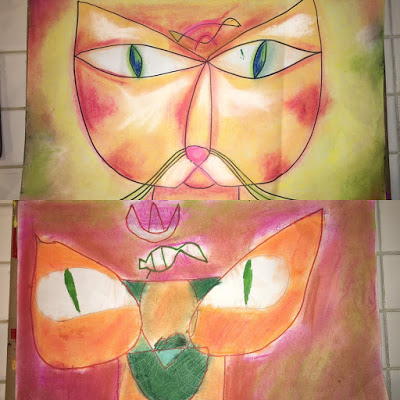
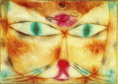
The first work we'll explore is Cat and Bird. This is a great example of balance versus symmetry in art. The cat's face is not symmetrical (exactly the same on either side), but it is balanced. If you divide the composition into thirds, either horizontally or vertically, you can see that there is a point, counter point or weight to balance the planes. This could definitely lead to some math work in symmetry or fractions, homeschool moms!

Point out to your kids that the face is composed of two tear drop shapes that overlap in the middle like a Venn diagram (oh, that math again!), with a u shape for the mouth and that same tear drop shape, pulled out on either side, for the eyes. Add a heart nose, whiskers, and whatever is on the cat's mind! Trace over your picture with Sharpie, then erase the pencil lines.


We did our pictures with chalk pastels, choosing three colors for the cat's face and a few additional for the background. The key to working with pastels is blending and layering, blending and layering.

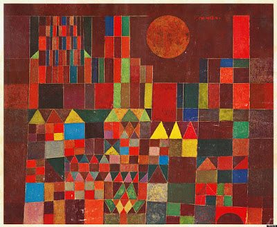
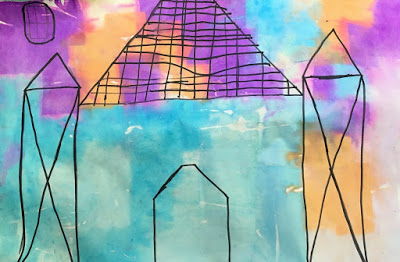
Our next project was inspired by Castle and Sun.


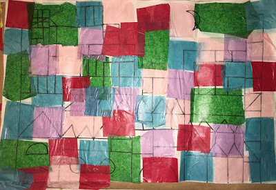
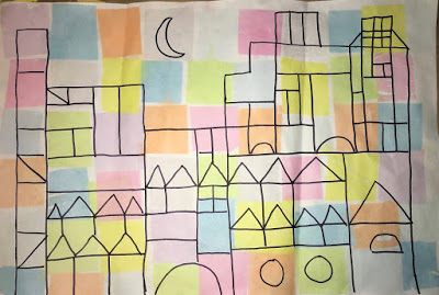
In this painting, Klee works with more rigid geometric shapes, appropriate for a strong castle. You could have your kids draw a castle free hand, with a ruler, or even pull out classic wood blocks and trace around them. Once they have a satisfactory castle, trace with Sharpie and erase the pencil. Make sure you use a waterproof ink to trace with, not Crayola markers!

Next, wet the paper with a brush dipped in water and apply squares of colored tissue paper, then go over the tissue once more with a wet brush. The dye from the paper will bleed onto the paper after a few minutes. Please test your tissue ahead of time - some papers have fixative that prevents bleeding, and some colors are so light that they don't leave much on the page.


After a few minutes, remove the paper and it looks like watercolor!


Since Klee uses such strong, identifiable geometric shapes, this is a great project to do with a geometry unit!

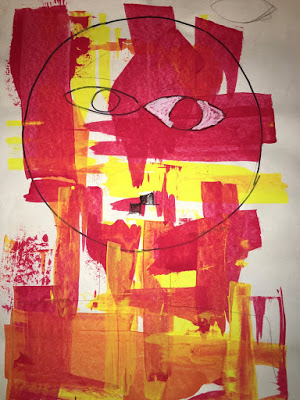
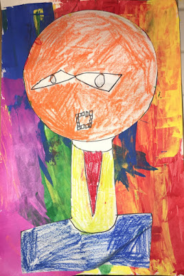
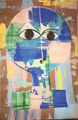
The last project is inspired by the painting Senecio. In this painting, Klee combines the organic, balanced elements from Cat and Bird with the hard geometry of Castle and Sun. 


We followed the same steps as above with drawing in pencil then Sharpie, tracing a paper plate for the head and adding a center line to divide the face and aid with drawing in the features. Next, grab an old gift card or one of those fake credit cards that come in the mail, and a little tempera or acrylic paint. Load a little on the edge of the card and scrape it down the paper.


Create the background the same way, then cut out the face and glue it on your background:


Max chose to color his face with oil pastels instead. I must say that I have not been inspired by the kid's art books about Klee that I have seen, but there may be some good ones floating around out there. However, there are some great internet resources, including this video for grade school kids, and this slide show for any age. You can catch my Periscope about these projects and my thoughts on instruction vs. creativity here. Great art, math and music tie ins - you can't go wrong with Paul Klee!

Wednesday, January 13, 2010

Oreo


This is Oreo. He came to us via a wonderful local rescue group, HARP. He is adjusting to life in the Maupin household, and he is one serious love bug. He gets so relaxed when you pet him that he'll actually fall over, but look out when the feather wand is near! He was very curious about the camera, and wasn't too interested in holding still for a nice, posed shot. This was one of the few non-blurry pictures. He is really bonding with Madeline, and runs up to greet her when she gets home from school. That's exactly what we had hoped for. Now if he'll just stop walking over my keyboard...


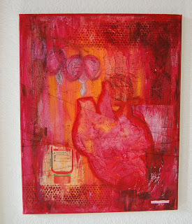
Yes, I have finally finished a painting. I started this in May, I think. The background sat around forever. Yet another heart, I know, but what can I say? I'm obsessed.  Let's just call it a series. That doesn't sound so crazy.

Monday, June 1, 2009

What I should be doing right now...


I'm taking an online collage class, mainly to kick my butt into gear and get back to painting. Three works in progress, and I've spent the last hour surfing sites and blogs. I need to go paint now.

Monday, July 21, 2008

Art Journal Pages


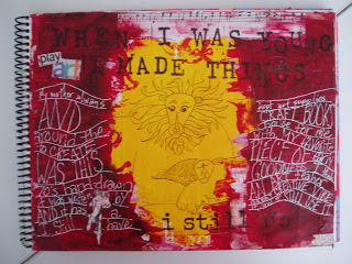
As you know, I'll be teaching the art journal class in September, and since my gallery isn't playing nice on mac.com (they have just revamped it with the whole mobile me, iphone thing and I need to mess with it some more, I guess), I decided to post a few here. The link on the left, "My Gallery" seems t work for me, but maybe that's because it's my account. Could someone let me know if it doesn't work for them?)

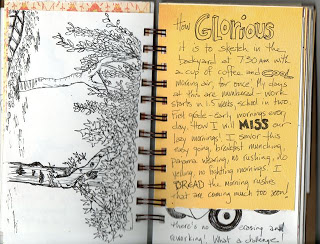
I am currently keeping four journals - one for paint/mixed media, one for pencil, a process book for techniques/class info, and a new one for ink. I've always admired ink illustration, but I'm a pencil girl by nature. So, I bound some scraps of cardstock and even a few printed papers, and am trying to teach myself how to sketch in ink. And it's HARD, for me at least. Trying to keep a simple line and not use sketch lines has been the biggest challenge. I love sketch lines - that's how I "feel" a shape when I draw. I am so used to reworking a sketch in pencil until it's to my liking, but you can't do that in ink. The more I "work" it, the worse it looks. The Danny Gregory books I ordered arrived on Saturday, and I've finished Everyday Matters and am on to The Creative Life, so I hope my technique might improve a bit. These are definitely not the best drawings I've ever done, but I believe it is important to post them. Art journals are for exploration, not perfection. Lots of my pages look like crap, but that's part of the process. I sometimes fear that people might get scared away from trying an art journal when they read books about it, because all of the pages look like beautiful finished artwork, not an exploration. Yes, I love some of my pages, and laugh at others. It's all part of the process...
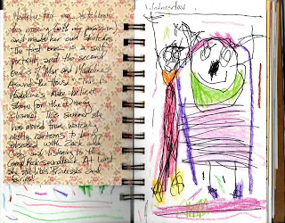
I had to upload one of the pages Madeline did in my art journal. She decided she wanted one, too, so I pulled out the Bind It All and now she has her own purple journal. :)